About the project:
Venice is a small credit company which offers credits to micro and small other business. Its proposal is to transmit, through its branding, security, conextion and seriousness.
Role: Branding Designer
Brand’s name
The brand’s name comes from the italian city, which was the inspiration for me in order to develop the visual identity.
References
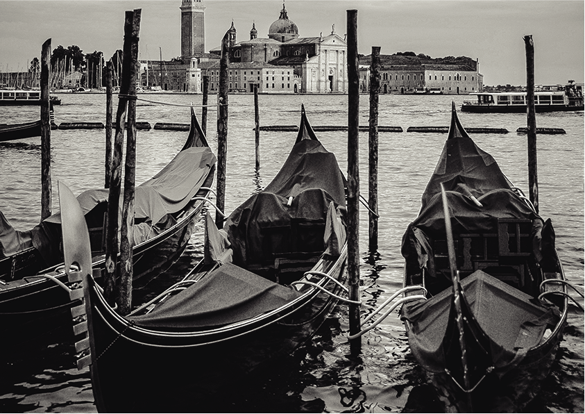
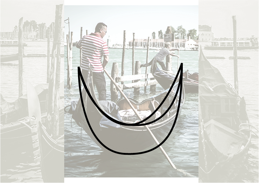
In Venice there’s a very famous long narrow boat that is used to transport people, called: gondola. That was (and still are) a way to connect people. That was the main inspiration to brand’s design, combining security, connection and Venice itself.
Tipography
The selected font transmit visual comfort when combined with the brand’s symbol. It is a serif-font wich adds a sense of elegance at the same time.
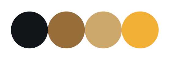
Colors
The dark tones transmit, despite elegance and seriousness, stability. The other ones were selected in order to transmit the idea of coin/money/credit. (To represent money, the most logical color would be green, right? But on this project the intention was to escape from the obvious).