About the project:
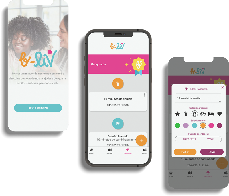
B-liv is a program specially made for the bariatric to seek informations and, at the same time, take care of their new stage of life. The users can create health journey, define goals, record achievements, recieve health tips and sometimes chat with specialists (nutritionist and/or doctor).
Role: Product Designer (UI) and Brand Designer
Tools: Figma; Photoshop; Illustrator
Requirements
The interface must transmit happiness and confidence;
It has to be clean and «talk to» women and men;
Some functions required:
- Chat (with healthcare profesionals)
- Activity log
- Food record
- Sleep control
- Mental health monitor
- Self-care tips
The challenge
To design a product that might be visually pleasing. At the same time, the interface has to be easy to use.
Research
The first research method used was the Exploratory. Through an online form was posible to identify usage patterns and to track a user profile:
- Answers: 141
- Average age: 34,8% between 36 and 45 y.o. (49 users)
- Female: 74,5% (105 users)
- Did the bariatric surgery: 73,8% (104 users)
- Main reason to do the surgery: Morbid obesity (70%)
- What would be good on an app to bariactrics: To track measures and jorney (34 users).
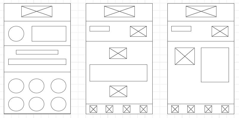
Wireframes
Brand creation
The brand had to transmit proximity; happiness and it has to be posible to be used mostly on digital medias.
The logo itself is full of meanings:


Colors
The colors used on the entire project were based on the brand itself. It was required colors who could represent happiness, confidence and diversity of bodies/people.

Icons
For the iconography was applied the principle of Material Design, by using the Font Awesome 5. By using a pre-made pack of icons we gained more time to focus on the others parts of the project (at that time I was the only designer avaliable).

Prototype
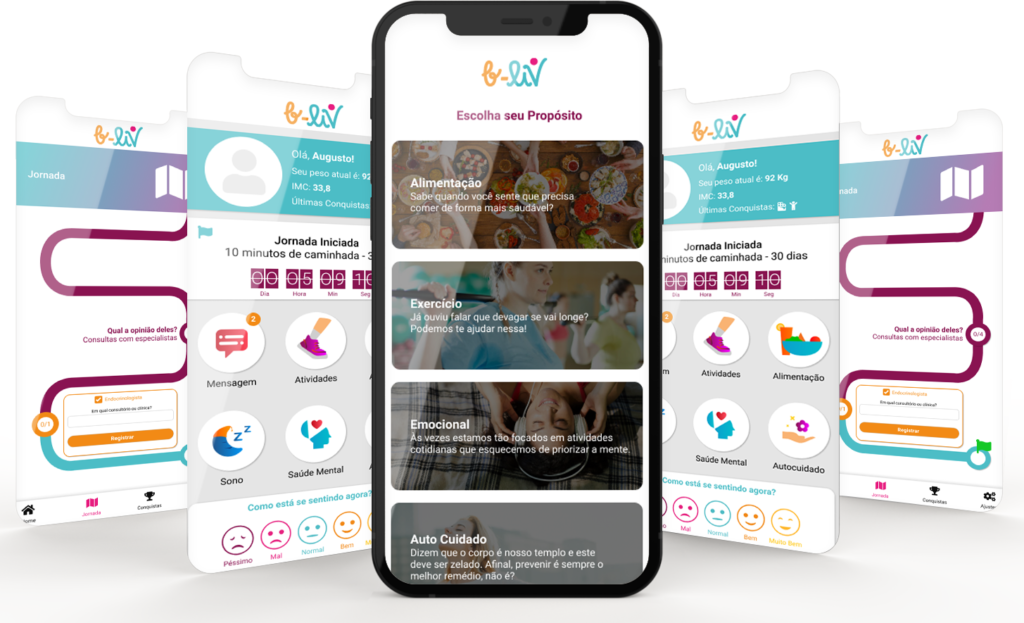
On the main screen the user would be capable to see their profile photo, name, height, IMC and the last achievements (see image below). After that, they could see their jorney and have access to the main functions of the app: Message (chat); Activities; Food; Sleep; Mental Health; Self-care.
The «how you feeling» section had the intention to record and to create a calendar with the most frequent feelings the users were going through daily.
On the «tip of the day» section the users had access to health tips about life, excercise, food and curiosities about health.

Alerts
The dialog box (and alerts) are the most clear as posible so the users do not get lost when or what they’re willing to do.


Journey
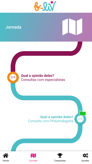
On the journey screen the users could input their achievements, in order to keep with the health life (or to do the surgery).


Landing page
In order to release the project the team needed to have a web page and, about that, I was the responsible for creating it too. Soon you can check the landing page creation here.